
Unit 7 Flash banner
this is a google banner made to sell advertisement space on the Youtube website.
for the research portion of this work iv decided to annotate a google banner add its has an interesting simple style and a strong colour theme for each banner segment.
Research

The first section of the banner gives a clear message "your ad here" we instantly know what being sold. I like the choice of using different shades of orange for the first slide of the ad. Using different shades of one colours with the simple design make the ad feel very warm inviting even though im not the intended demographic for this ad it makes me want know more about whats being sold anyway,


The second and third parts of the ad follow the same trend. now saying "or here" with a a tablet and phone on display instead of the PC showing if someone were to buy the ad space it would be displayed on multiple platforms the colour choices are smart the phone with the green gives the idea of being out and about, while the purple with the tablet gives the idea of being at work. this helps the even more helping further the point of how many different ways the banner ad can reach its intended audience


The last 2 banners go to googles iconic colour palate its the part of the banner for those left interested and gets down to business. it shows the consumer some basic number of viwers who will see the ad and associates the ad with googles brand.
Ideas and Planning
To create a successful banner ad for pepsi I need to first consider the target audience.
Primary:males aged 15-20
Secondary:females aged 15-20
Since pepsi is one of the cheapest branded cola products it would mainly be bought by people on a budget and people who just prefer the taste over other branded cola products.
This leads me to believe that an ad showing a product as delicious and affordable would be the best idea moving forward.
I plan to keep the ad simple and too point while still holding strong colors to stay eye catching.
I think the best way to achieve that would be a fun tag line and clear banner.
my ad will use the tag line "pepsi refreshing anywhere" with a pepsi can in the center of the ad.
the back ground will be multiple location beach, park, shopping center, mountain peaks, and space (not in that order). I thought i'd use space as the last slide to add a bit of humor to the ad. Pepsi wants to be seen as a down to earth company that cares and the silly humor helps demonstrate that without risking anything that could be seen as controversial.
the banner ad plan works with what my goals are. the message is clear the products center stage so consumers don't get confused, i'm keeping it simple with the background being the only thing that changes. and I believe the last slide being space with a little ufo would add the fun I wanted to put in the banner

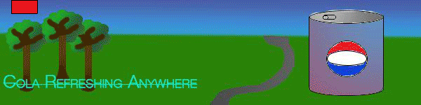
Im happy with the end result of unit 7 I was able to complete most of the slides for the ad. The ad its self has a clear message that doesn't get lost in banner the background are colorful and aids in the advertisement as a visual representation with the tag line of the ad being "cola refreshing anywhere" the background shows an a-ray of location with some of them being comedic. while doing this unit iv realized iv forgotten some of the more complex features of adobe photoshop and illustrate this left me with a limited number of tools leaving the backgrounds rather empty and lacking detail and the cola looking like a can of soup. over all i'm satisfied with the execution and have fixed problems i had earlier in the year with overly complex ideas and a lack of a full plan but I plan to get more familiar with photoshop and illustrate so I can create more complex and interesting work with confidence.